Organic chemists often think in terms of potential energy surfaces, especially when plotting the results of a computational study. Unfortunately it is non-trivial to generate high-quality potential energy surfaces. It's not too difficult to sketch something crude in ChemDraw or Powerpoint, but getting the actual barrier heights correct and proportional has always seemed rather tedious to me.
I've admired the smooth potential energy surfaces from the Baik group for years, and so several months ago I decided to try and write my own program to generate these diagrams. I initially envisioned this as a python package (with the dubiously clever name of pypes), but it turned out to be simpler than expected, such that I haven't actually ever turned it into a library. It's easier to just copy and paste the code into various Jupyter notebooks as needed.
Here's the code:
# get packages
import numpy as np
import scipy.interpolate as interp
import matplotlib.pyplot as plt
# make matplotlib look good
plt.rc('font', size=11, family="serif")
plt.rc('axes', titlesize=12, labelsize=12)
plt.rc(['xtick', 'ytick'], labelsize=11)
plt.rc('legend', fontsize=12)
plt.rc('figure', titlesize=14)
%matplotlib inline
%config InlineBackend.figure_format='retina'
# x and y positions. y in kcal/mol, if you want, and x in the range [0,1].
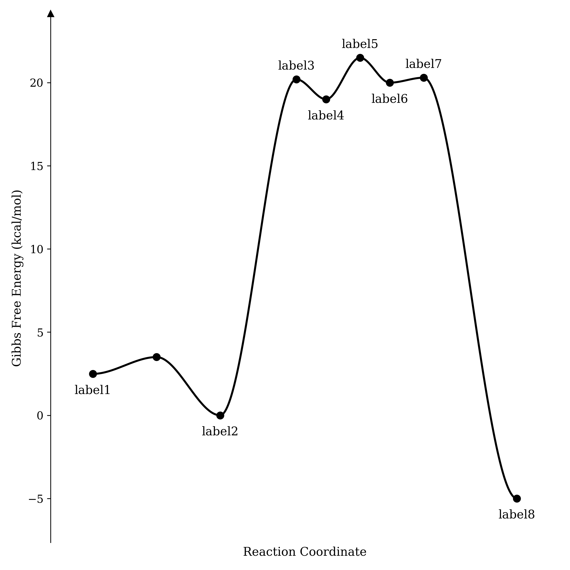
Y = [2.49, 3.5, 0, 20.2, 19, 21.5, 20, 20.3, -5]
X = [0, 0.15, 0.3, 0.48, 0.55, 0.63, 0.70, 0.78, 1]
# labels for points. False if you don't want a label
label = ["label1", False, "label2", "label3", "label4", "label5", "label6", "label7", "label8"]
#### shouldn't need to modify code below this point too much...
# autodetect which labels correspond to transition states
TS = []
for idx in range(len(Y)):
if idx == 0 or idx == len(Y)-1:
TS.append(False)
else:
TS.append((Y[idx] > Y[idx+1]) and (Y[idx] > Y[idx-1]))
# sanity checks
assert len(X) == len(Y), "need X and Y to match length"
assert len(X) == len(label), "need right number of labels"
# now we start building the figure, axes first
f = plt.figure(figsize=(8,8))
ax = f.gca()
xgrid = np.linspace(0, 1, 1000)
ax.spines[['right', 'bottom', 'top']].set_visible(False)
YMAX = 1.1*max(Y)-0.1*min(Y)
YMIN = 1.1*min(Y)-0.1*max(Y)
plt.xlim(-0.1, 1.1)
plt.tick_params(axis='x', which='both', bottom=False, top=False, labelbottom=False)
plt.ylim(bottom=YMIN, top=YMAX)
ax.plot(-0.1, YMAX,"^k", clip_on=False)
# label axes
plt.ylabel("Gibbs Free Energy (kcal/mol)")
plt.xlabel("Reaction Coordinate")
# plot the points
plt.plot(X, Y, "o", markersize=7, c="black")
# add labels
for i in range(len(X)):
if label[i]:
delta_y = 0.6 if TS[i] else -1.2
plt.annotate(
label[i],
(X[i], Y[i]+delta_y),
fontsize=12,
fontweight="normal",
ha="center",
)
# add connecting lines
for i in range(len(X)-1):
idxs = np.where(np.logical_and(xgrid>=X[i], xgrid<=X[i+1]))
smoother = interp.BPoly.from_derivatives([X[i], X[i+1]], [[y, 0] for y in [Y[i], Y[i+1]]])
plt.plot(xgrid[idxs], smoother(xgrid[idxs]), ls="-", c="black", lw=2)
# finish up!
plt.tight_layout()
plt.show()
The output looks like this:
If you like how this looks, feel free to use this code; if not, modify it and make it better! I'm sure this isn't the last word in potential-energy-surface creation, but it's good enough for me.